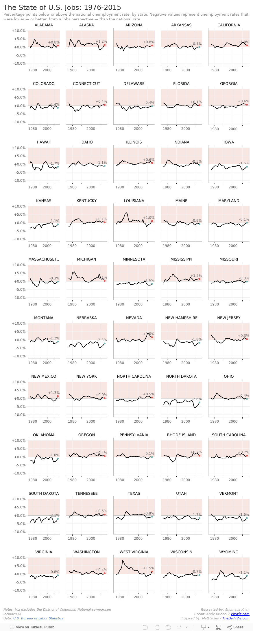
Week 3 challenge consisted of using unemployment data to create a visual showing how much the unemployment rates for each state differed from the national unemployment rate.
Creating this dashboard taught me a lot about the dashboard layout and how to manipulate location of each of the sheets that are placed in the view. To view this workbook on my Tableau Public page you can click here.