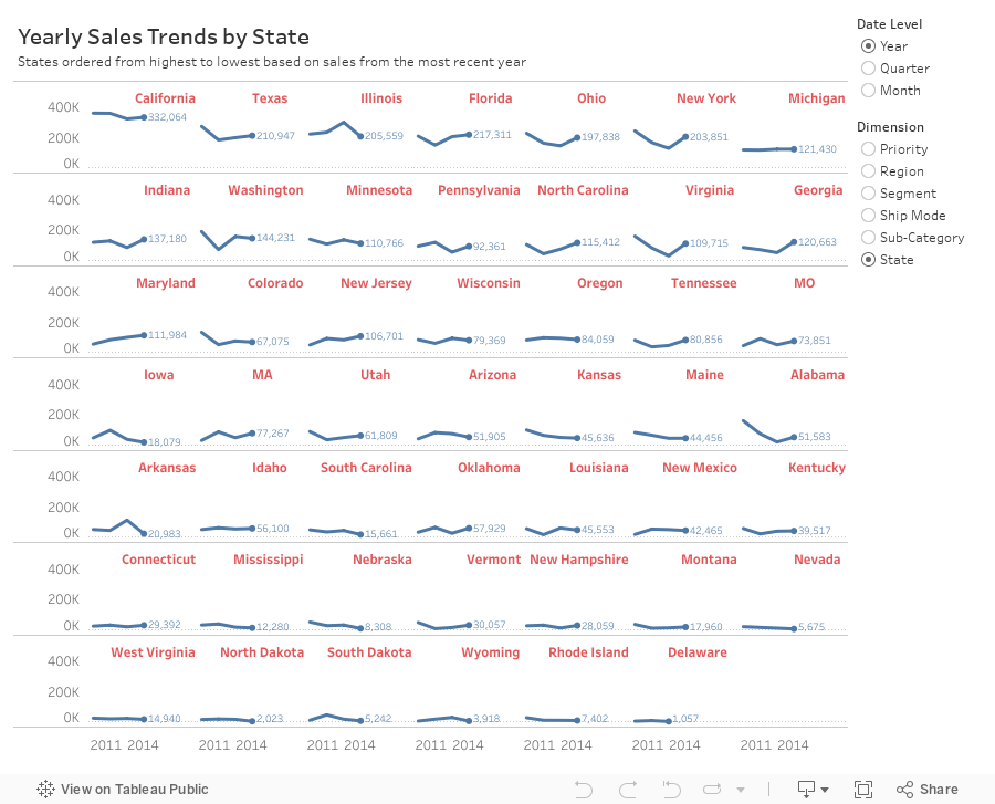
Week 7 challenge was to create a trellis chart that is dynamic and allows the user to select dimensions and time scale.
I recreated this using parameter definitions and relating them to the charts with a calculated field. It was particularly difficult to get the trellis to automatically update properly where all points were placed in the right section. This a great way to show a lot of information on one chart. The credit for this goes to of the DataFam community on Tableau Public. There’s a great tutorial by Andy on YouTube on how to create a trellis chart.
To view this workbook on my Tableau Public page you can click here.